The license plate frame is one of the few spots on your car you can make entirely your own. Choosing it comes down to five things: what it says, which font, which colors, which background and who it's for — you, a gift or your business. Once you know the answer to those five questions, the design falls into place on its own.
Most people don't start from “which frame do I need,” but from a feeling — I want my car to look like mine, not like every other one in the parking lot. That's the right starting point. A frame doesn't solve a problem; it says something. That's why the question isn't “which is the best frame,” but “what do I want mine to say.”
(A note on words: frame, holder, mount, plate, base for a number plate — it's all the same product. Different people call it differently. Here we use “frame,” but we mean the same thing: the base plus the strip that sits under the plate.)
First: what to put on the frame
This is the decision that sets everything else. From the real orders we make, the text is usually one of five things:
Name or nickname
The classic — your name, nickname or something personal. It makes the car instantly recognizable as yours.
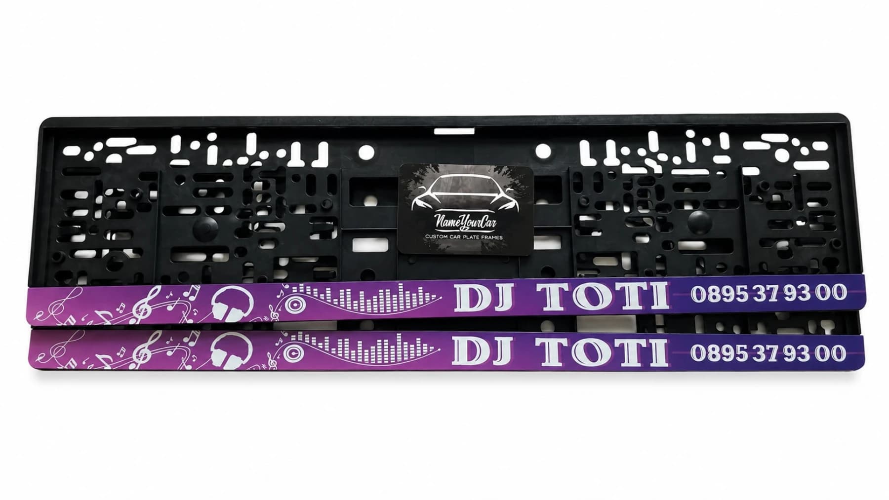
Motto or favorite line
A phrase that means something to you — a motto, a quote, a word that describes you. This is the choice of people who want character, not just a label.
Favorite team
The colors and name of the team you support. You wear it in the stands — why not on the car too.
Car make or model
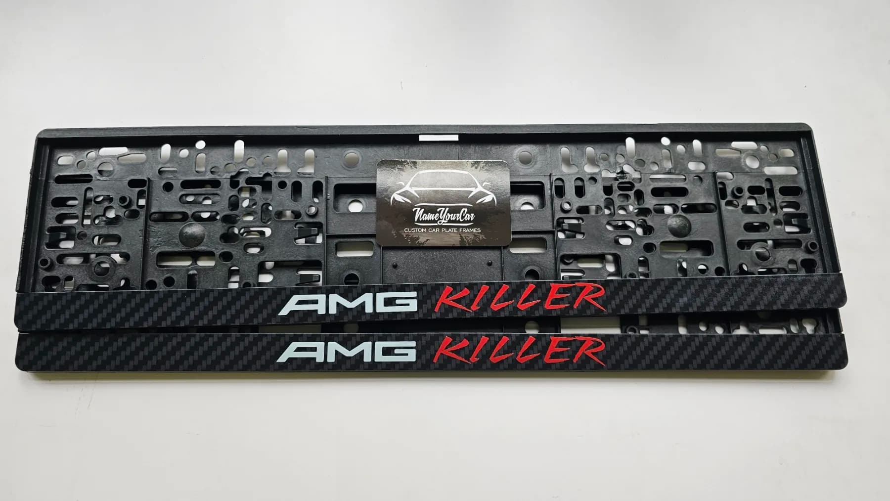
An inscription tied to your car or the driving style you like. The enthusiasts' choice.
Business advertising
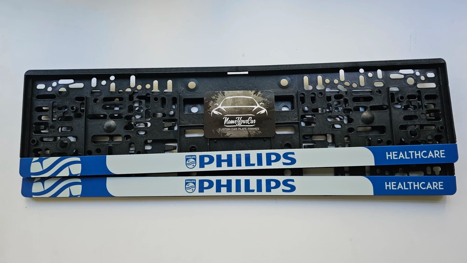
A logo, phone number and social-media icons (Facebook, Instagram, TikTok). The car moves all day — for companies it's advertising that works at no extra cost.
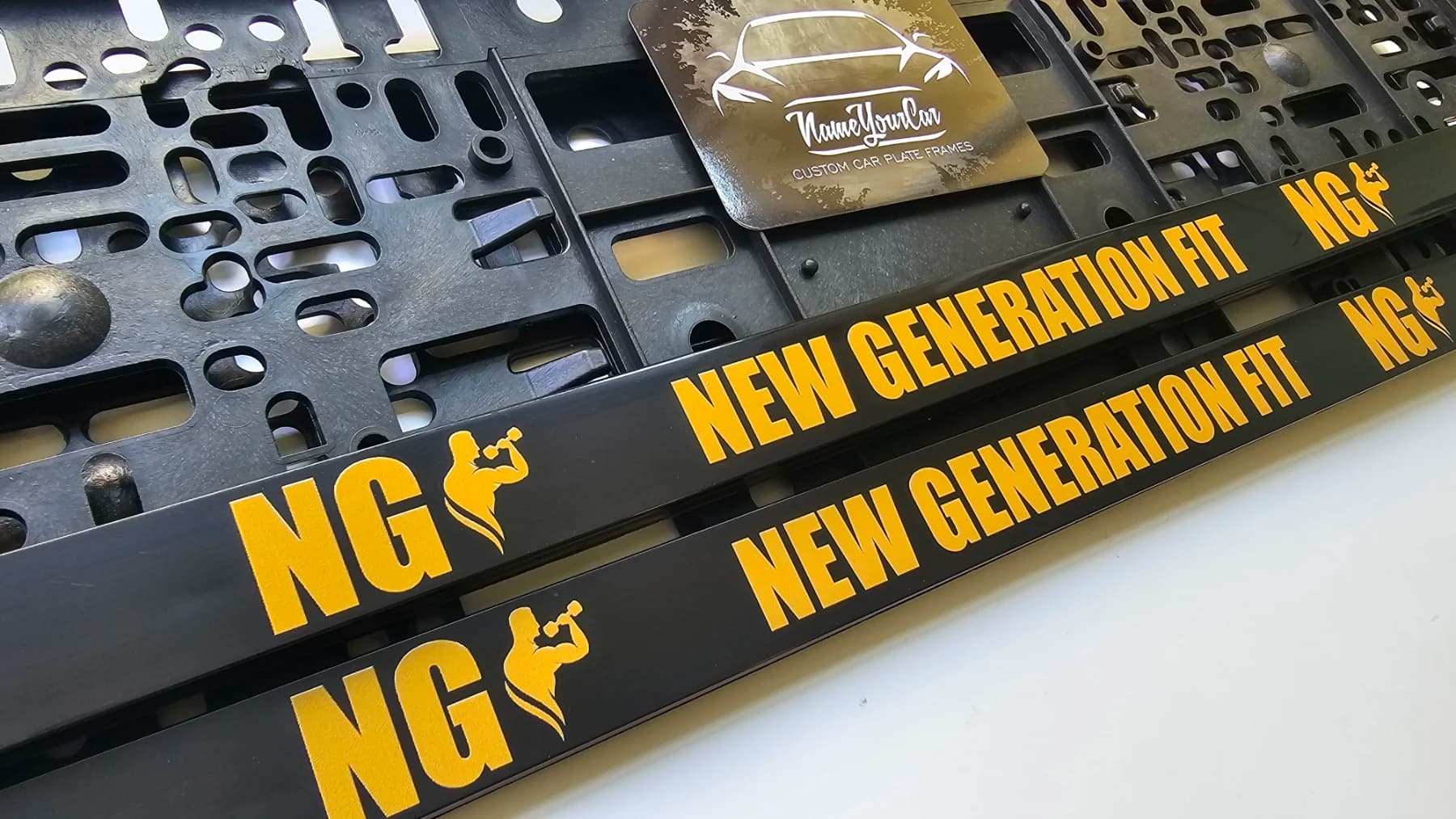
If you're making a frame with a brand, logo or team name that isn't your own — make sure you have the right to use it. For your own brand or personal content there's no such question.
The font sets the character
The same text looks completely different depending on the font. Here the choice is usually between three directions:
Print font
Clean, legible, businesslike. Suited to advertising, company frames and anyone who wants a clear, crisp look.
Handwritten font
More personal and warm. Works well for a name, a gift or anything that wants to look individual rather than corporate.
Bold or unconventional font
For character and style. Sporty, musical or energetic themes, where the letter itself is part of the message.
There's no wrong choice — only one that fits the tone. Business advertising in a too-playful font confuses; a personal motto in a too-severe font loses its warmth.
Color and background: how much to stand out
After the text and font comes the look of the strip itself. There are two questions here.
The colors — of the text and the background. We make them in any colors, so they can match the color of your car, your team's colors or a company's brand palette. Contrast is what makes the lettering legible from a distance.
The background of the strip has three options:
No background — text on plain black/neutral. A discreet, clean look.
Partial background — a colored accent on only part of the strip. A balance between discreet and noticeable.
Full background — the whole strip in color or gradient. Maximum standout, for those who want it seen.
The more background and color, the more the frame stands out. A discreet personal inscription often looks best with no or partial background; an advertising or branded frame usually wants a full background to get noticed.
Who it's for: you, a gift or a business
The same product is chosen differently depending on who it's for.
For you
Go by your taste. The rule here is simple: like it, don't explain it.
For a gift
Think of the person, not yourself. A nickname, favorite team, inside joke or something tied to their car turns the frame into a personal gift.
For a business
Think like advertising. The logo legible, the phone clear, the colors on brand. The goal is for someone to read it from the next lane and remember it.
How to see it before you decide
The surest way to choose is to see it. Instead of imagining how a name will look in a given font and color, you can put it together live — text, font, color and emblem — and see the result right away, before you order. That way the choice between those five questions stops being abstract.
Know what you want your frame to say? See how it looks — put together the text, font and color and see the result right away, before you order.